


2
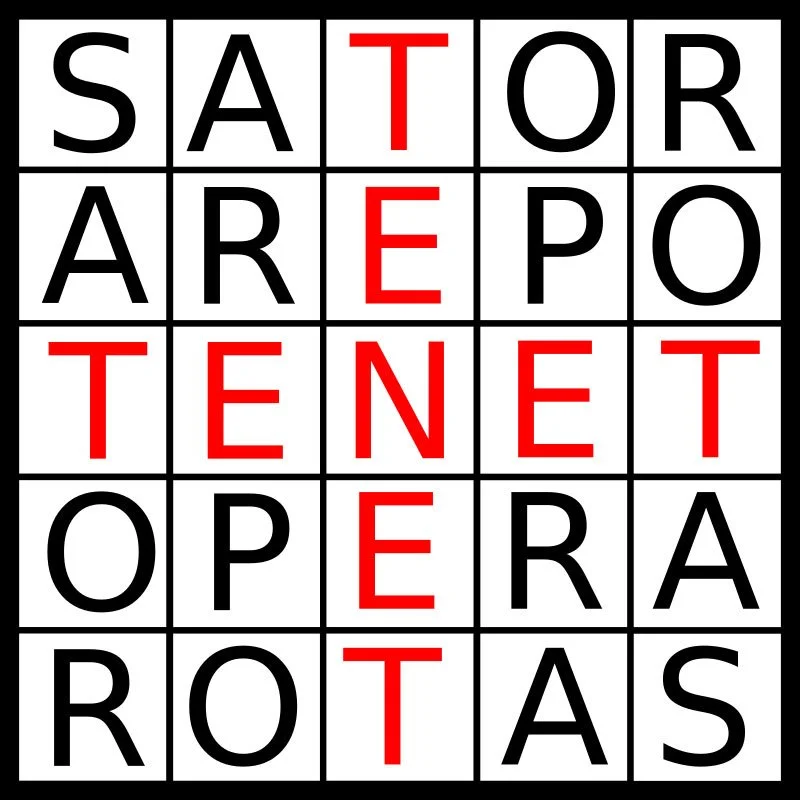
Sator Square

1
Peace 2

2
Peace 1

1
Would It Help

2
Believe

1
Close Your Eyes And Breathe

2
Love

2
Carpe Diem

2
RBG (Ruth Bader Ginsburg)

2
I Am A Man

1
FUCK
1
Michelle's Words

1
Peace

3
Be Kind Or Leave

1
Call Your Mom

1
Everything In Life Is Temporary

2
What Every American Aspires To

1
Joey's Hearts

1
KellyAnne's Cubism

1
Golden Banners

2
Glitteroval

1
Glass Pebbles on Mirror

2
Book As Hook
1
Wrong Time

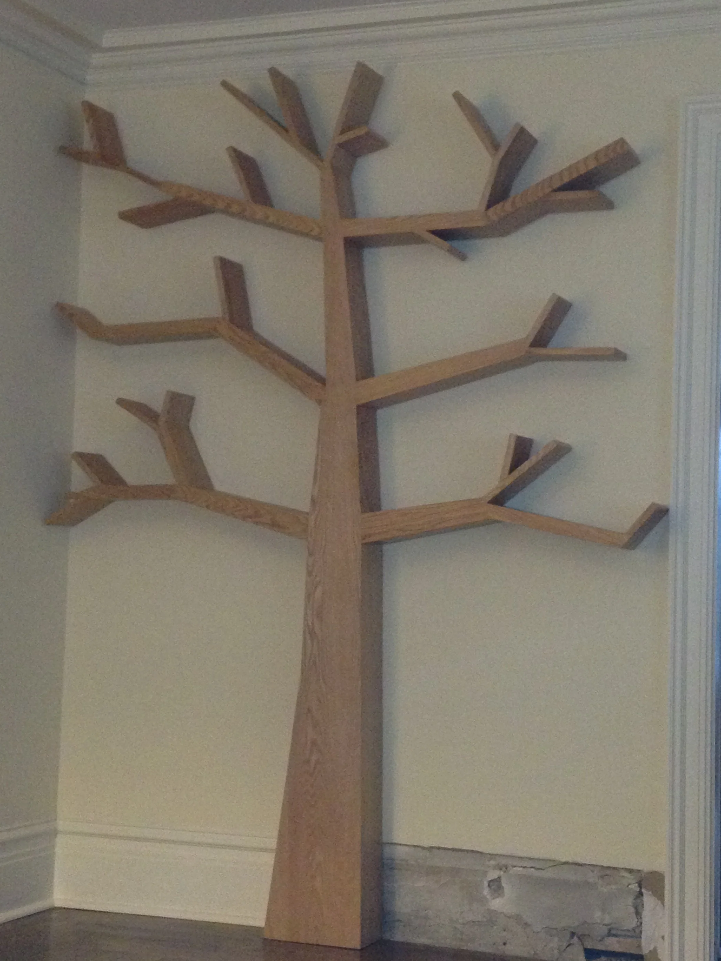
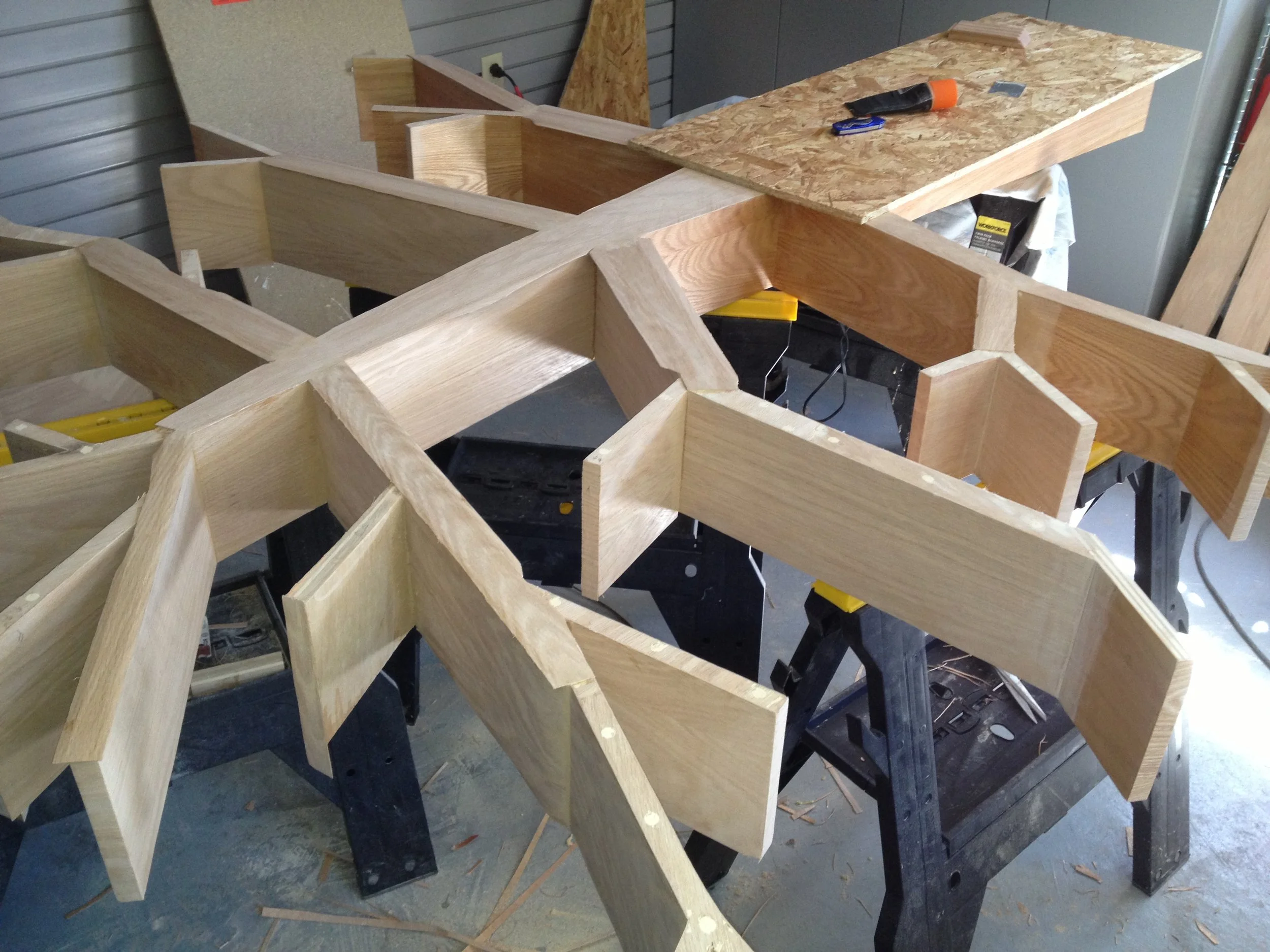
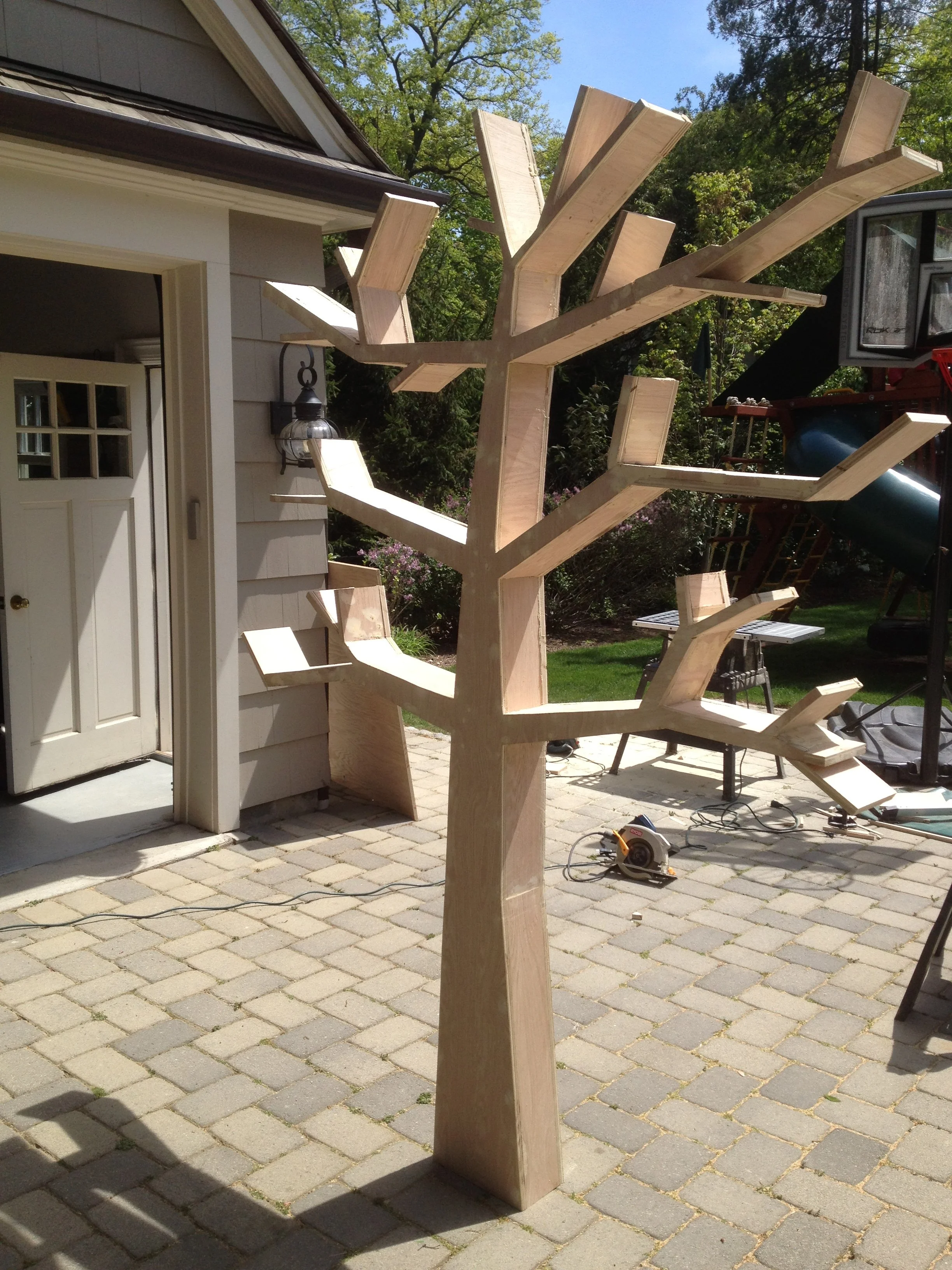
5
Trees as Bookshelves

2
Framed Thermostat

2
Oceans

1
Water

2
Karen

1
The Accountant's Art Work

1
Froth

2
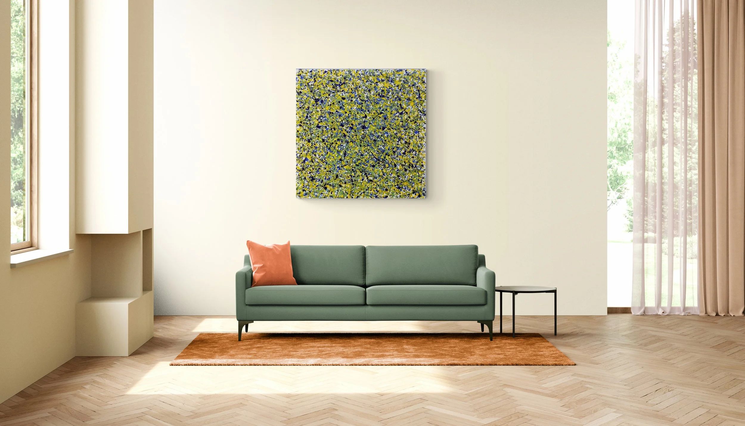
Spring Lawn

1
Gletscherspalten

1
Graue Blume

1
Red2Red

1
Give Me The Blues

2
Ooh That's Black

2
Chinese Vase

1
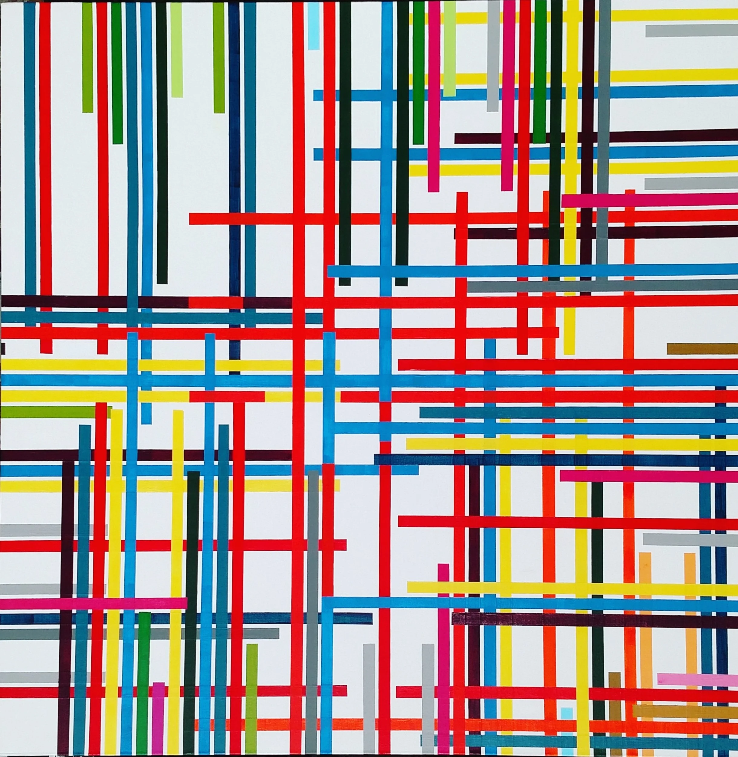
Drips